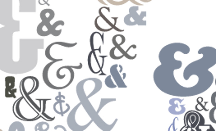

The symbol ‘&’ is derived from the ligature of ‘ET’ or ‘et’, which is the Latin word for ‘and’. One of the first ampersands appeared on a piece of papyrus in circa 45 AD. Written in the style of early Roman capital cursive – the handwriting of the time and the inscriptional style of the time – it shows the ligature ‘ET’. A sample of Pompeian graffiti from 79 AD shows a combination of the capitals ‘E’ and ‘T’ in early Roman script.
Later documents display a more flowing, less formal cursive in ‘Roman Rustica’, or Roman handwriting, which evolved into lowercase and italic. The appearance of a ligature ‘et’ became more prevalent. The connection between the capital letters ‘E’ and ‘T’ was initially formed by writing rapidly. Later calligraphic manuscripts show the middle part of the ‘E’ made up of many semicircles, joined to the ‘T’ by a more intentional, flowing horizontal line.
By the time scribes developed Carolingian minuscule (the beginning of the lowercase) about 775 AD, the ligature had become a standard part of a font. The left side of the ampersand is either a lowercase ‘e’ or a capital ‘E’. The oblique upstroke might be a leftover from the horizontal stroke in the ‘E’ or ‘e’, or a line forming a connection to the next character.
Compared with the italic style, the Roman version of the ampersand shows only a faint remainder of the ‘t’.
Today, ‘&’ is incorporated into the design of every font and part of every Latin alphabet. The variations of the symbol are uncountable, particularly in italics. Apart from the straightforward ‘&’, which appears in the Roman style, italic-style ampersands are influenced by calligraphy and show great creativity.
Some typefaces have beautiful ampersands – italic ampersands for Garamond, Minion, Janson, Meridien, Baskerville and Caslon. With the appearance of slab serif and sans serif typefaces in the 19th century, type founders preferred the classic Roman version of the ampersand we all know – ‘&’ – in italic as well as Roman styles.
There are many interesting variations of the ampersand, such as those created by the Renaissance writing master Arrighi, and the 16th century French type designer Granjon. The Poetica typeface family, which was designed by Robert Slimbach from Adobe, was based on the commercial writing style of the Italian Renaissance – Cancelleresca. It offers 58 different ampersands.
Frank Romano is professor emeritus at the Rochester Institute of Technology
Comment below to have your say on this story.
If you have a news story or tip-off, get in touch at editorial@sprinter.com.au.
Sign up to the Sprinter newsletter
